Table of Contents
BEST IELTS Academic Writing Task 1, 10th December
IELTS ACADEMIC WRITING TASK 1

IELTS ACADEMIC WRITING TASK 1
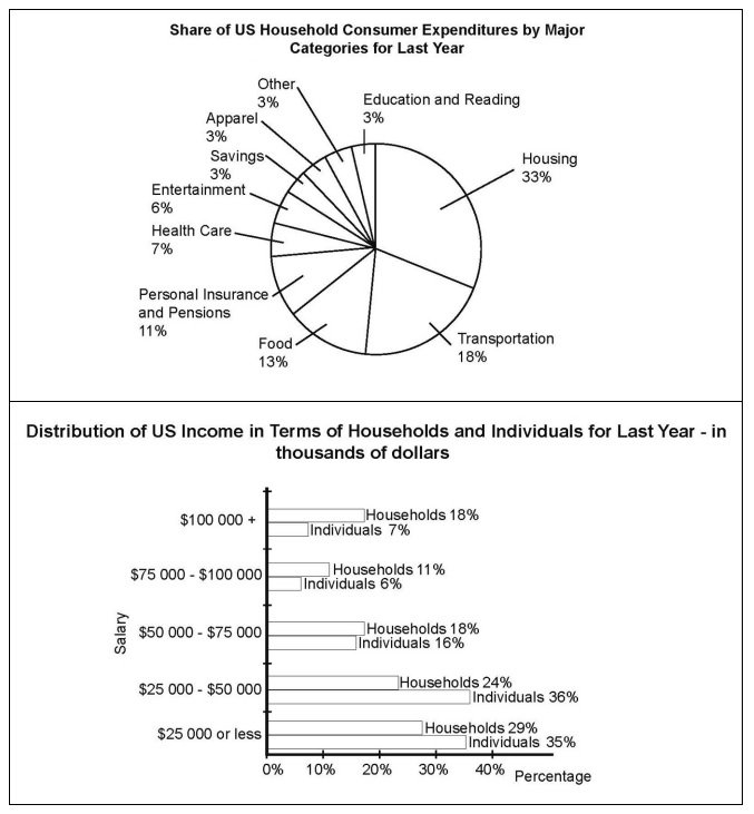
The pie chart below shows the share of US household consumer expenditures by major categories for last year. The bar chart shows the distribution of income in terms of households and individuals for the same year. Summarise the information by selecting and reporting the main features, and make comparisons where relevant.

SAMPLE ANSWER
The bar chart shows percentages of US income distribution in thousands of US dollars for both households and individuals for last year. The pie chart shows percentages of how the money earned last year by US households was spent on various consumer categories.
The bar chart shows that the greatest frequency of incomes for both individuals and households were for the bands $25,000 to $50,000 and $25,000 or less with 36% of individuals and 24% of households in the former band and 35% of individuals and 29% of households in the latter band. The smallest frequency of incomes for both individuals and households were for the bands $75,000 to $100,000 and $100,000 or more with 6% of individuals and 11% of households in the former band and 7% of individuals and 18% of households in the latter band. The mid-range salary band of $50,000 to $75,000 accounted for 16% of individuals and 18% of households.
The pie chart shows that over half of all this US income last year was spent on housing and transportation, at 33% and 18% respectively. Smaller proportions were spent on food, insurance and pensions, health care and entertainment with 13%, 11%, 7% and 6% respectively. Only 3% of income was spent on savings, apparel and ‘other’.
Although these are generalised figures, the charts show that a disproportionate amount of everyone’s income in the US was spent on housing and transportation, reflecting the possible cultural importance of having a good place to live and how much travel is necessary in the US.

IELTS Academic Writing Task 1