Vocabulary For Pie Chart
Percentage Fraction
80% four-fifths
75% three-quarters
70% seven in ten
65% two-thirds
60% three-fifths
55% more than half
50% half
45% more than two fifths
40% two-fifths
35% more than a third
30% less than a third
25% a quarter
20% a fifth
15% less than a fifth
10% one in ten
5% one in twenty
Percentage Qualifier
77% just over three quarters
77% approximately three quarters
49% just under a half
49% nearly a half
32% almost a third
Percentage proportion / number / amount
/ majority / minority*
75% – 85% a very large majority
65% – 75% a significant proportion
10% – 15% a minority
5% a very small number
EXAMPLE

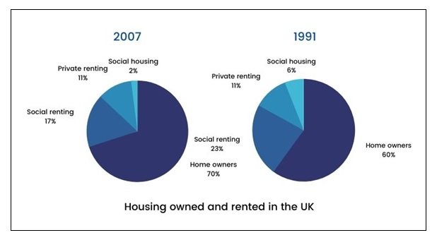
The given pie charts illustrate the comparability of homeownership and renting in the UK in two different years, 1991 and 2007. In 1991, owning a house was the most popular housing type, accounting for 60%, or over half of the statistics. Social rented homes, amounting to 23% or nearly one-third of homes, turned out to be the next largest sector. The rest of the houses were typically privately rented (11%), with a tiny fraction being social housing (6%).
On the contrary, in 2007, the number of homeowners had upsurged to 70% or almost three-quarters of all homes. Most of the increase in homeownership can be explained by the decrease in social rented homes, which had dropped to 17%.
The percentage of houses privately rented stayed consistent and unchanged at 11%. However, compared to 1991, in 2007, there were 5 million more homes. From 1991 to 2007, the number of social housing had decreased three-fold from 6% to 2%, thereby being the least popular type of housing.
