Table of Contents
BEST IELTS Academic Writing Task 1, 11th April
IELTS ACADEMIC WRITING TASK 1

IELTS ACADEMIC WRITING TASK 1
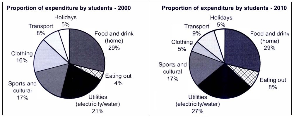
The charts below show the proportion of expenditure by students, on average, at one university, in 2000 and 2010. Summarise the information by selecting and reporting the main features, and make comparisons where relevant.

SAMPLE ANSWER
The pie charts illustrate the average percentage of students’ expenses at one university in two different years, in 2000 and 2010, which are divided into seven categories. Overall, several categories remained stable in the period given, while transport, eating out, and utilities experienced an increase and clothing was the opposite.
In 2000, food and drink was accounted for 29%, which was the highest proportion compared to others. Moreover, it was followed by utilities with 21%, showing a moderate difference. On the other hand, clothing and sports and cultural were nearly the same with 16% and 17%, respectively. The other categories, such as transport, holidays, and eating out, held lower percentages with no more than 10%.
In 2010, holidays and food and drink still unchanged with 5% and 29%, still placing the smallest and greatest proportion. Similarly, sports and cultural also persisted with 17% as it was the third biggest number. In contrast, clothing declined substantially from 16% to 5%, which was the same percentage as holidays, whereas utilities marginally rose to 27%. Likewise, transport and eating out slightly went up to 9% and 8%, respectively.
