IELTS WRITING TASK 1: HOW TO DESCRIBE A LINE GRAPH
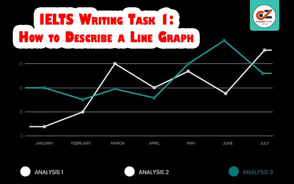
In the IELTS Writing Task 1, candidates are required to describe a visual representation of data, such as a line graph, bar chart, pie chart, or table. In this case, the task focuses on describing a line graph, which typically illustrates trends over a period of time.
Here’s a comprehensive guide on how to describe a line graph effectively in IELTS Writing Task 1.
Understanding the Line Graph
Before beginning your description, it’s important to thoroughly understand the line graph. It generally consists of:
– X-axis (horizontal axis): This represents time, categories, or another independent variable.
– Y-axis (vertical axis): This represents the dependent variable, which can be quantities, percentages, or measurements.
Make sure to identify what each axis represents, what the lines depict, and any key trends or patterns. Often, there will be more than one line, which compares different sets of data.
HOW TO DESCRIBE A LINE GRAPH
Step-by-Step Approach to Describing a Line Graph
1. Introduction (Overview of the Graph)
Begin by providing a general overview of the information. Do not go into specifics yet; just summarize the key trends.
Example: The line graph illustrates the changes in the number of visitors to a museum over a five-year period.
Key Points to Include:
– The general subject of the graph.
– The time frame.
– The general trend or comparison (e.g., upward, downward, or fluctuating).
HOW TO DESCRIBE A LINE GRAPH
2. Overview/Key Trends (Identify Major Trends)
The overview is a crucial part of your description because it highlights the main features of the graph. Avoid focusing on specific data points here—focus on the general trend or pattern.
Example: Overall, the number of visitors to the museum experienced a steady increase from 2015 to 2019, with a noticeable dip in 2017.
Key Trends to Look for:
– General increase or decrease.
– Any significant fluctuations or stability.
– Peaks, troughs, or anomalies.
HOW TO DESCRIBE A LINE GRAPH
3. Detailed Description (Specific Data Points and Trends)
Now, you can dive into the details. Describe the key changes over time and compare the data where relevant. Use time markers and describe the trend year by year, or in a way that makes sense based on the graph.
Example: In 2015, the number of visitors was just over 100,000. This figure gradually increased in the following years, reaching 130,000 by 2016. However, in 2017, there was a significant decline to 110,000 visitors, before rebounding to 140,000 in 2018. The number of visitors peaked at 160,000 in 2019.
Key Phrases to Use:
– Increase: rose, went up, grew, climbed, surged, escalated.
– Decrease: fell, declined, dropped, decreased, plunged, sank.
– Stability: remained stable, stayed constant, leveled off.
– Fluctuation: fluctuated, varied, oscillated.
HOW TO DESCRIBE A LINE GRAPH
4. Comparisons (If There Are Multiple Lines)
If there are more than one line on the graph, it is important to compare the different sets of data. You may discuss which line had higher or lower values at particular points in time or how the lines intersect or diverge.
Example: While the number of visitors to the museum steadily increased over the five years, the number of online visitors showed a marked decline during the same period, dropping from 50,000 to 30,000.
Use comparative phrases:
– Higher/Lower: greater than, less than, higher than, lower than.
– Difference: The difference between… was significant, showed a notable gap, etc.
HOW TO DESCRIBE A LINE GRAPH
5. Conclusion (Summarize Key Points)
The conclusion should restate the main trends you’ve discussed without introducing new information. Often, this is just a brief summary.
Example: In summary, the museum saw a steady rise in visitors over the five-year period, with only a brief dip in 2017.
Language Tips and Useful Phrases
– Time References: Use words like “from,” “to,” “between,” “over the period,” “at the start/end,” “by the end of,” etc.
– Adverbs and Adjectives: Use appropriate adjectives for trends such as “significant,” “slight,” “moderate,” “sharp,” and “steady.”
– Data Expressions: Use phrases like “rose to,” “increased by,” “dropped to,” “peaked at,” “leveled off,” and “fluctuated around.”
HOW TO DESCRIBE A LINE GRAPH
Example Answer:
The line graph shows the number of visitors to a museum over a five-year period, from 2015 to 2019. Overall, the number of visitors to the museum increased steadily, with a brief decline in 2017.
In 2015, the number of visitors was just above 100,000, and it rose gradually each year, reaching approximately 130,000 in 2016. However, in 2017, the figures dropped to around 110,000 before recovering to 140,000 in 2018. By the end of the period in 2019, the number of visitors had peaked at 160,000.
This pattern demonstrates a consistent rise in the number of visitors, apart from the temporary dip in 2017.
When describing a line graph for IELTS Writing Task 1, always focus on the main trends, changes, and comparisons. Structure your answer logically, starting with an overview, followed by specific details, comparisons if necessary, and a brief conclusion. Be sure to use a wide range of vocabulary to describe the trends accurately, and avoid presenting too much detail—focus on the most important points.
HOW TO DESCRIBE A LINE GRAPH

HOW TO DESCRIBE A LINE GRAPH