Table of Contents
BEST IELTS Academic Writing Task 1, 4th September
IELTS ACADEMIC WRITING TASK 1

IELTS ACADEMIC WRITING TASK 1
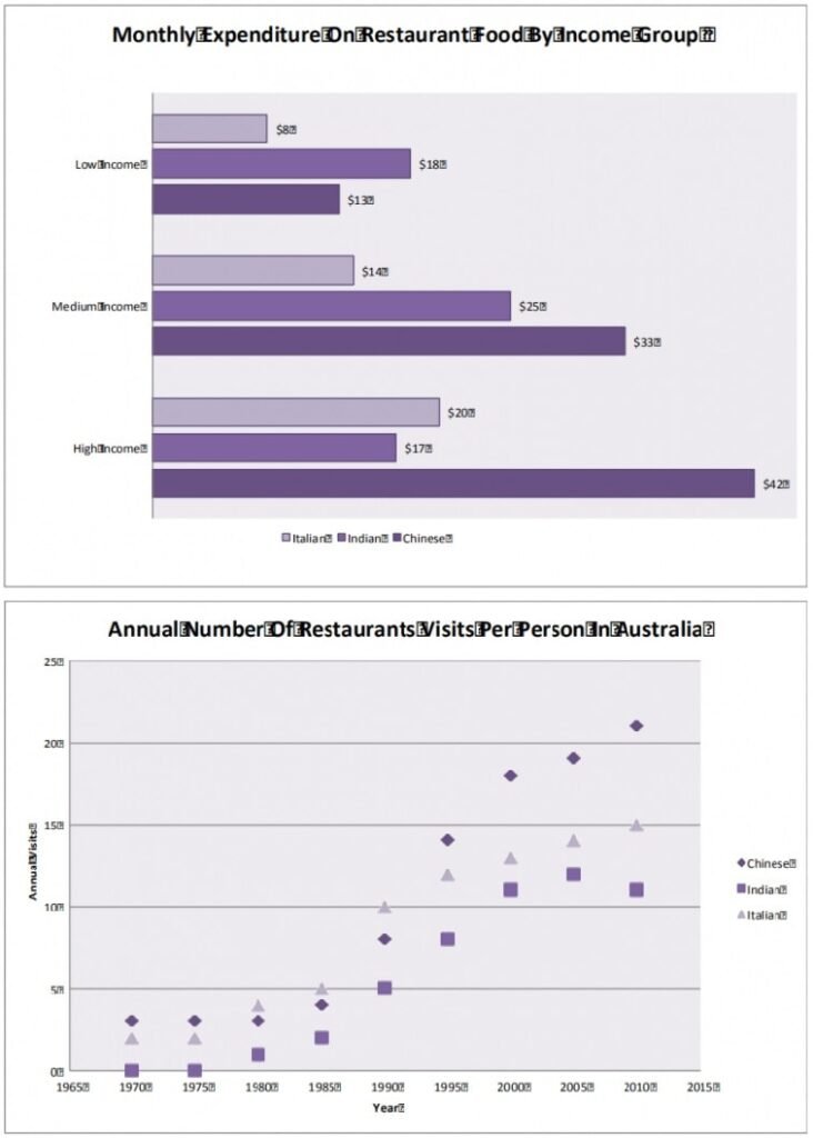
The graph shows the monthly expenditure on three types of restaurant food in Australia. The plot shows the annual number of restaurant visits for the same types of food between 1965 and 2015.
Summarise the information in the charts and make comparisons where appropriate.

SAMPLE ANSWER
The bar graph shows the expenditure of different income groups in Italian, Indian and Chinese restaurants in Australia, while the scatterplot shows the number of annual visits per person to the same type of restaurants between 1965 and 2015.
The proportion of money spent on Chinese and Italian food is similar for high ($42 and $20), medium ($35 and $14) and low ($13 and $8) income groups. As people’s income becomes higher, the proportion of money that is spent on Indian food drops from being the most to least favoured style of food. This suggests that Indian food is preferred because it is the least expensive option.
In 1970 the total number of restaurant visits per year was approximately 5 visits per person, which was made up of 3 and 2 visits per person to Chinese and Italian restaurants, respectively. The total remained low until 1985, but after that time increased steadily to around 50 visits per year by 2015. After 1985, the number of visits to Chinese restaurants increased in a continuous upward trend reaching 22 visits per person per year by 2015, while visits to Italian and Indian restaurants initially followed a similar trend but the number of visits began to level out after the year 2000 reaching 15 and 12 visits per person per year by 2015, respectively.
People having higher disposable incomes and less free time are probably the causes of the dramatic change in eating habits.
IELTS Academic Writing Task 1
