Table of Contents
BEST IELTS Academic Writing Task 1, 30th March
ACADEMIC WRITING TASK 1

ACADEMIC WRITING TASK 1
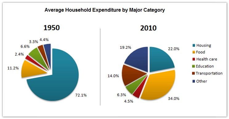
The pie charts below show the average household expenditures in a country in 1950 and 2010.
Summarise the information by selecting and reporting the main features, and make comparisons where relevant.

SAMPLE ANSWER
The pie charts show the expenses made in housing, food, healthcare, education, transportation and other items in a country in 1950 and 2010. As is observed from the pie charts, in 1950 almost two-third expenditure was in housing whereas this average expenditure has been increased for food, transportation etc. in 2010.
According to the given data, more than 70% expenditure of the people in this country went on in housing in 1950. The second most expenditure in this country was for food. All other expenditures including healthcare, education, transportation etc. were less than 20% in total. After 60 years the trends of expenditure in this country significantly changed. People’s expenditure in housing decreased to only 22% while the expenditure for food increased to just over one-third of the total. Interestingly, the expenditure on education decreased over the time while the expenses for transportation increased to 14%. All other expenditure in 1950 was only 4.4% which increased to roughly 20% in 2010 which indicates the new addition in the category where people started expensing more than they did in 1950.
In summary, the expenditure nature of people had changed significantly in 2010 than that had been in 1950 and it is obvious that expenses on food upsurged.

